Home Modern Workplace Mastery Modern Workplace Mastery: Day 5 – Making It Feel Like CalderCloud: Tenant Branding and the First User Sign-In Experience

Modern Workplace Mastery: Day 5 – Making It Feel Like CalderCloud: Tenant Branding and the First User Sign-In Experience

Illustration of a calm digital workspace with a large floating sign-in panel in front of a cloud city skyline, and one person reviewing the tenant sign-in design.Why Day 5 Matters (and why it comes now)

There’s a moment in every Microsoft 365 rollout that looks tiny in a project plan and huge in real life.


A new starter (or a tired, returning colleague) types their email address, clicks Next, and stares at a sign-in page that could, in theory, belong to almost anyone.


In a world full of phishing, training and horror stories, they’re not just thinking about their password. They’re quietly asking:

“Is this actually us… and what happens if I get this wrong?”

In the Modern Workplace Mastery series, Tenant Foundations (Day 0 to 4) has already done the heavy lifting for CalderCloud’s new tenant; what it isn’t yet is emotionally trustworthy.


Day 5 sits exactly there. Yes we still are in tenant foundations, but now we’re dealing with the first thing real humans will see and feel: the sign-in experience and the first few minutes that decide whether Microsoft 365 feels like a safe environment or a risky experiment.


This post shows how CalderCloud makes the tenant feel deliberately theirs by using three levers:

  • Tenant branding that signals “you’re in the right place” without shouting
  • Help links and support surfaces that make “how do I get help?” obvious, not stressful
  • A designed first user experience that reduces cognitive load instead of adding to it

We treat all of this as foundations work because confusion and doubt aren’t just annoying; they are stressors. When people aren’t sure if a sign-in page is legitimate or who to call when something breaks, they experience real anxiety, not just “user error”. That has a mental health cost as well as an adoption cost.


As always, this post has two sections – the “TL;DR” section for those who just want a quick “slide” view and the “Detailed” section where the information is accurate (to January 4th, 2026) and is written to give a reader the more definitive information

Table of Contents

TL;DR – Modern Workplace Mastery - Tenant Branding

If you’re short on time or simply want to see where this post is heading before you dive into the deep dive detail, this TL;DR is for you.


Think of it as the storyboard for Day 5: How CalderCloud turns the Microsoft 365 branding and sign-in page from “default blue wallpaper” into a deliberate, tested and supportable front door for the new tenant.


The slides walk through the key decisions and the rollout and the first-user experience.

If any slide sparks a “we need this in our tenant”, you’ll find the full information, tables and guidance waiting for you in the Full Content section below.


The aim is simple: you should be able to mirror this journey in your own tenant or dev environment, learning from CalderCloud’s choices without exposing any real organisation or real people, and without wading through yet another pile of shallow “how-to” snippets.

The sign-in page is tenant foundations

• Every sign-in page is a trust event: users ask “is this really us?” before they type anything.
• A confusing or inconsistent front door increases cognitive load and quietly drains mental energy every day.
• Tenant branding isn’t “making it pretty”; it’s part of security, adoption and mental health.
• Day 5 treats the sign-in experience as foundational tenant work, not a last-minute theme.

Principles of a calm, legitimate sign-in (Introducing the P.A.C.K)

• Predictable: same look and feel across days, browsers and common flows; no surprise experiments.
• Accessible: colours, contrast and layout chosen for real hardware, not just design mocks.
• Calm: low-noise visuals and copy; no big red warnings unless something is genuinely wrong.
• Kind: assumes users may be stressed, tired, anxious or not technical and designs for that reality.

What Entra Custom Branding can (and can’t) change

• You can set: logo, background image, accent colours and short sign-in/help text in Entra.
• You can’t turn sign-in into a full marketing page or change core Microsoft flows and prompts.
• Some surfaces never show full branding; “no logo” does not automatically mean “phishing”.
• Legacy CSS exists only in some older tenants; new tenants created on (and after) January 5th, 2026 will not have a CSS option at all.

Ownership, governance, and change control

• The sign-in experience should have an owner (service/identity owner), not “whoever has portal access”.
• All changes go through a simple but real change process, not late-night “quick tweaks”.
• A single branding/change record tracks versions, reasons, approvers and dates.
• This record becomes the anchor for testing, rollout, help wording and rollback decisions.

Designing the CalderCloud branding pack

• Branding is captured as a small branding pack: logos, background, palette and sign-in text.
• The CalderCloud palette is defined once and reused; contrast and readability are checked up front.
• Assets are stored with versioned names (v1, v2…) so we can roll back safely.
• The pack includes concise accessibility notes and where SVG vs PNG is used.

Implementing branding in Entra (without breaking trust)

• Implementation happens through the Default sign-in experience in Entra, plus Graph/PowerShell if needed.
• Sysadmins apply the branding pack; IT Leads approve; end users see a consistent, legitimate front door.
• Changes are made in small, deliberate steps, not big bang experiments in production.
• Every implementation change is linked back to the branding/change record and the version.

Test before rollout: the sign-in test matrix

• CalderCloud uses a test matrix that covers realistic accounts, devices, browsers and flows.
• Tests include first sign-in, remembered accounts, MFA prompts, SSPR and a “bad day” accessibility pass.
• Results capture not just “Pass/Fail” but how it felt; confusion, hesitation, reassurance.
The matrix lives beside the branding pack and change record and feeds decisions required in later day 5 sections.

Calm rollout and post-change “signals”

• Rollout uses a light ring plan: lab → IT/project → friendly pilot → wider organisation.
• Users get short, clear comms about what is changing, what isn’t, and why it’s being done.
• The service desk has a script and official screenshots to answer “is this legit?” calls.
• After go-live, CalderCloud watches for signals (call tickets, language, patterns) and tweaks branding aspects if needed.

One front door for help (including when you can’t sign in)

• There is one clear front door for sign-in worries: the "CalderCloud IT Service Desk".
• Help details appear on sign-in and SSPR pages and include an dedicated phone number.
• Wording explicitly normalises doubt: you’re encouraged to "pause and ask if something looks wrong".
• A simple A4 crib sheet gives service desk agents a consistent, reassuring way to respond.

First user experience and feedback loops

• We use a simple fictitious story (Amira on her first day) to model what good feels like in the first 15 minutes.
• A first-user checklist tracks first sign-in, first MFA, first SSPR and first “this looks odd” call.
• Early users are asked how it felt on their devices, in their own words; especially if they were nervous.
• Feedback is written into the same change record, so experience sits alongside the technical change.

Checks, gotchas and rollback patterns

• Quick checks help distinguish “weird but expected” from genuine problems (URL, tenant, guests, caching).
• A gotchas table records quirks: partial branding, propagation lag, guest branding, legacy CSS, native app limits, etc.
• Rollback is controlled: either via Entra UI or Graph/PowerShell using versioned branding scripts and assets.
• Clear triggers define when an odd sign-in becomes a security incident, not just a UX issue.

What you now have and what you should do next

• You leave Post 5 with: a branding pack, change record, test matrix, rollout and help patterns, first-user checklist and gotchas list.
• Together, these make the sign-in experience designed, testable, supportable and reversible, not “whatever someone clicked once”.
• Next steps are to carry the same ethos into later Tenant Foundations work (identity, devices, onboarding surfaces).
• The long game: a CalderCloud tenant where the front door quietly supports trust and mental health, instead of chipping away at them.

First 15 minutes: what we’re aiming for

Before we talk about Entra Custom Branding, imagine you’re a new CalderCloud employee on your first morning. You’re at home, on your own laptop, slightly nervous about a new job and a new set of systems.


You click the link in your welcome email. The sign-in page that appears looks calm and obviously CalderCloud: logo, background, nothing screaming for attention. A single line of text tells you this is the CalderCloud sign-in page and quietly reminds you who to call if anything ever looks wrong.


You type your new CalderCloud email address. The next screen looks and feels like the same place. When a security prompt appears on your phone, it doesn’t feel like a jump scare; it’s consistent with what you were told to expect, and the same CalderCloud name is there to anchor you. For a moment you hesitate – this is, after all, the front door to your new workplace – but the visuals and wording are enough for your brain to decide “yes, this is legitimate”.


You get in. Later that week, you forget your password and hit “Forgot my password?”. The reset page looks like the same world. If anything seems off, the same help name and phone number you saw on day one are there. You may feel annoyed with yourself, but you don’t feel stupid, tricked or alone.


Everything else in this post exists to make that first 15 minutes, and every morning after it predictable, calm and supportable. The rest of this post explains how we design, implement, test and operate that experience in a real Entra-backed tenant.

For CalderCloud’s employees, the first contact with the new tenant isn’t a dashboard or a welcome email. It’s a sign-in page that, to a normal person, could belong to almost any organisation on earth.


They type their email address, click Next, and they aren’t just thinking:


“What’s my password?”


They’re thinking:


“Is this actually CalderCloud… or could this be a scam?”

“What happens if I get this wrong and lock myself out?”

“If something breaks, who do I even call?”


That’s legitimacy in practice: not a logo in a brand book, but whether a tired person at 08:45 feels safe enough to continue.


Microsoft leans into this by allowing organisations to customise the sign-in experience with company branding; logos, backgrounds, layout and text, plus some more advanced options in older tenants. That capability exists to help users recognise a legitimate sign-in quickly, not to create a marketing billboard. Used well, it lowers cognitive load; used badly, it adds noise.


For CalderCloud, the question is simple:

“Can a user tell, within a couple of seconds, that this sign-in belongs to CalderCloud and is safe to use?”

If the answer is no, people compensate in messy ways: they back out and try again with a different account, they ping colleagues for reassurance, they delay setup tasks, or they click through prompts on autopilot just to get the discomfort over with. None of that looks dramatic on a dashboard, but it’s all extra mental effort.


That extra effort is what we mean by cognitive load. The more the sign-in journey forces people to juggle questions about identity, safety and consequences, the less capacity they have left to actually engage with the tools once they’re in. Over time, that becomes:

  • “adoption issues”
  • vague service desk tickets (“it keeps asking me for something”)
  • and quietly, for some people, a spike in anxiety every time something new appears on screen

From a support point of view, these aren’t clean incidents. They’re “confidence failures”: nothing is technically broken, but the person at the keyboard doesn’t feel confident enough to proceed.


That’s why this sits in Tenant Foundations rather than in a “nice-to-have UX” chapter. A tenant can be structurally correct and securely configured and still feel untrustworthy. When that happens, people either avoid it or survive it. They don’t thrive in it.


For Day 5, CalderCloud defines success like this:

  • A user can see, quickly and calmly, that they’re signing into the CalderCloud work environment.
  • The sign-in journey feels predictable, not experimental.
  • When something does feel off, the route to help is obvious enough that people don’t feel alone with the problem.
  • Every change we make at this boundary is reversible and owned, because trust is easy to damage and slow to rebuild.

The rest of this post takes that problem seriously: we’ll design the branding pack, implement it, test it, and wire in support cues so that this critical moment is a source of reassurance, not friction.

CalderCloud approaches sign-in branding with one uncomfortable observation:


Microsoft 365 gives you just enough flexibility to make a beautiful mess.


On one hand, Entra gives you enough control to make the sign-in experience feel recognisably “yours”. On the other, it also gives you enough rope to create a confusing, noisy, high-stress wall of colour that people have to fight through before they can even start work.


Because this sits in the “Tenant Foundations“, CalderCloud treats branding options as behavioural controls, not creative toys. The aim is simple:


Reduce uncertainty and mental load at sign-in so real people – whatever their job title is – feels safe and calm enough to get on with their day.


Behind that are four principles CalderCloud doesn’t compromise on.


Subtle, not loud

The sign-in page is already an anxious place for many people. It’s where passwords live, security prompts pop up and training messages about phishing echo in the back of their minds. If branding shouts for attention on top of that, it makes the whole moment harder than it needs to be.


CalderCloud wants a user to glance at the screen and think, “Yep, that looks like CalderCloud,” and then stop thinking about it.


In practice, “subtle” means keeping the design calm and understated:

  • a single clear identity (name and mark), not a collage of variations
  • backgrounds that don’t fight with the form or text
  • no slogans, campaigns, seasonal themes or novelty graphics on sign-in
  • nothing that tries to look cleverer than the task at hand

Subtle branding is almost invisible. That’s the point.


Consistent wherever people authenticate

Most people don’t know or care whether they’re hitting Entra, Microsoft 365, Teams on the web or a mobile app. They just see a flow of screens that either feel familiar or don’t.


If the sign-in journey looks and feels different depending on where you land, your brain has to do extra work every time:


“Is this still my work account?”

“Why does it look different today?”

“Am I being redirected somewhere I shouldn’t be?”


CalderCloud uses branding as a consistency anchor. The organisation name, logo and overall tone should feel stable wherever authentication happens. That stability especially matters for people juggling multiple identities (work and personal Microsoft accounts) who are already having to think harder about which persona or profile they are using.


The measure is simple: the more the sign-in surfaces “just feel like CalderCloud” without needing explanation, the less mental energy people spend doubting them.


Accessible by default

Accessibility here is doing two jobs at once: it respects people with specific access needs, and it protects everyone from unnecessary cognitive strain.


CalderCloud applies a blunt test to every branding decision:


“Would this still work for someone who is tired, a bit anxious, on a mediocre laptop screen, not really reading the text?”


If the answer is no, the design is wrong, even if it looks beautiful in a design tool.


That leads to some hard rules:

  • avoid busy or high-detail images behind the sign-in form
  • maintain strong contrast between text, form elements and background
  • don’t rely on colour alone to signal meaning or status
  • keep logos legible at the small sizes Microsoft actually uses

These choices might feel “boring” to brand enthusiasts, but they create a quieter experience for people who are already carrying a lot in their heads. That’s an accessibility choice and a mental health choice.


Reversible and governed

Finally, CalderCloud treats sign-in branding as a governed change, not a casual tweak.


Entra makes it easy to add and edit branding once you have the right role. What it doesn’t do is protect you from the long tail of those decisions: the confused users, the nervous “has someone hacked us?” questions, or the future admin who has to untangle whatever was done.


To avoid that, CalderCloud insists branding changes are:

  • Owned: a named person (or role) is accountable for the current branding pattern.
  • Reasoned: there is a clear “why” behind each change, not just “because we can”.
  • Reversible: it’s always possible to get back to a known-good state quickly.

Microsoft makes it easy to change branding, but harder to delete the default sign-in experience entirely once it’s created. That’s a hint: changes here can hang around for years. If they’re not governed, you end up with “mystery visuals” nobody wants to touch.


So CalderCloud insists that every branding change records:

  • what changed
  • who approved it
  • who implemented it
  • how to revert to the previous state

That isn’t bureaucracy for its own sake. It’s a way of protecting trust: if a change spikes confusion or anxiety, we can undo it quickly.


The CalderCloud “nope list”

Finally, to stop well-meant chaos, CalderCloud has a short list of things we don’t do at sign-in:

  • no slogans, campaigns or seasonal themes
  • no long instructions embedded in the sign-in page text
  • no attempts to visually mimic Microsoft’s own security prompts
  • no rotating backgrounds “for variety
  • no multiple competing support routes (“email Bob, or call IT, or DM this Teams channel…”)

The sign-in experience is not a marketing canvas or an announcement board. It’s the front door to A persons working day. These principles exist so that everyone – regardless of role, energy levels or mental health on any given morning – can get through that door with as little friction as possible.

By this point CalderCloud has a set of principles. The next question is very practical:


“Where, exactly, can we influence the sign-in experience – and where does our control stop?”


Microsoft is clear that you customise the Microsoft 365 sign-in experience through Microsoft Entra custom branding, not by hacking bits of the Microsoft 365 portal. In Entra, you can add your organisation’s logo, an illustration or background image, and a block of sign-in text, plus some layout and icon tweaks.


I (personal opinion) think of this as a small set of levers on a control panel, not an invitation to redesign the whole cockpit.


What you can control (the supported surface)

Entra’s custom branding gives you a defined set of elements you can safely touch for the sign-in experience. Microsoft’s current documentation lists, among others:


  • Logos: a wide banner logo and square logos for light/dark themes
  • Background / illustration: a background image, plus a fallback background colour
  • Favicon: the tiny icon shown in the browser tab
  • Layout: choice of layout template and header visibility
  • Sign-in page text: a short block of text at the bottom of the sign-in page
  • Custom CSS: an optional CSS file in tenants created before 5 January 2026; Microsoft notes that tenants created after that date will not have custom CSS available for company branding at all.

Those are the official levers. Everything outside that list is either handled by other controls (like Conditional Access) or simply not customisable.


CalderCloud’s rule still applies here:


“if a change doesn’t make it easier for a normal person to recognise a legitimate sign-in and proceed calmly, it doesn’t matter how “on brand” it looks.”


What you can do with sign-in text (and why CalderCloud is careful)

Microsoft lets you add a block of text to the sign-in page, up to a documented character limit with some support for basic formatting.


That sounds like a perfect place to cram in instructions, warnings and links. CalderCloud treats it as a trap:

  • people are on high alert when they see a sign-in screen; they don’t read paragraphs
  • detailed instructions go stale quickly and are painful to update across languages
  • some URL fields can appear as non-clickable text in native clients, which confuses users further

So CalderCloud uses sign-in text only for short, durable reassurance and a pointer to the standard support route; not as a mini knowledge base.


What this does not control (the hard boundary)

It’s just as important to be clear about what branding doesn’t touch.


Even with beautifully tuned branding, you are not changing:

  • Authentication and security behaviour: MFA prompts, Conditional Access policies and risk-based sign-in are all defined elsewhere.
  • Underlying Microsoft UI: the core Microsoft sign-in flow is not replaced; you must not try to visually mimic security prompts in your own imagery.
  • Account hygiene issues: wrong account, wrong password, stale tokens and device problems remain what they are.
  • Communication and onboarding needs: branding can support clarity; it cannot, on its own, teach people how to use Microsoft 365. 

CalderCloud keeps a simple sentence in mind:


Branding helps people recognise a legitimate sign-in and feel calmer. It does not do security’s job, and it does not replace communication.


That sentence stops a lot of wishful thinking before it turns into scope creep.

What you should notice, and what to do if it looks wrong

As an end user, you never need to know which part of Microsoft 365 did the work. What matters is how you use the sign-in page as a safety signal.


A healthy CalderCloud sign-in experience should:

  • show a familiar organisation name and logo
  • feel steady over time, not like a constantly changing theme park
  • behave like a normal Microsoft sign-in page (no strange questions, no odd redirects)

If something about it feels off; an unexpected organisation name, unfamiliar colours, urgent wording that doesn’t sound like CalderCloud – the safest move is:


Pause, don’t push through, and use the official help route.


You are not expected to diagnose phishing or configuration mistakes alone. The whole point of careful branding is to make it easier to trust the real thing and to feel confident stopping when it doesn’t look right.

What you’re really approving

When you sign off branding, you’re not just approving a nice image. You are approving how your company will represent legitimacy at the front door of Microsoft 365.


Your decisions include:

  • which of the supported elements you’ll actually use (logos, background, text, layout, favicon)
  • how far you go: “minimal logos only” vs “logos + background + short reassurance text
  • what your minimum viable branded sign-in looks like for the next 6–12 months
  • how changes to that approved pattern will be governed and rolled back if they cause confusion

This is part of your risk story. A calm, recognisable sign-in pattern can reduce “is this legit?” calls and account-mixup incidents. An over-designed, ever-changing pattern does the opposite.

Where you work, and how to stay inside the lines

As a sysadmin, this section is mostly your map of the boundaries.


This is the surface you actually touch:

  • the Microsoft Entra admin centre, under Entra ID → Custom branding / Company branding, where Microsoft says sign-in customisation is configured
  • a small set of image uploads (PNG/JPG with specific sizes and file size limits), layout choices and text fields as documented in Microsoft’s guidance
  • optional custom CSS in older tenants only, with the clear constraint that new tenants created after 5 January 2026 don’t have this option at all


CalderCloud’s rules of thumb for you are simple:

  • use the fewest elements needed to achieve clear recognition
  • avoid clever CSS even where it exists; it’s fragile and easy to forget about
  • treat every change as something that should be versioned, tested with dedicated test accounts and easy to undo


You’ll see the practical “how” for UI and PowerShell (in further sections in this post) is here to make sure that when you start pushing buttons, it’s only on the parts of the experience that Microsoft actually supports you changing.

Changing the sign-in experience sounds small, but it touches the trust boundary of the tenant. When that front door looks different without warning, most people don’t think “nice refresh” – they think:


“Is this still safe?”

“Has something been hacked?”


For some, especially those already carrying anxiety or past bad experiences with security incidents, that moment is more than just a UX glitch; it’s a spike in stress. So CalderCloud treats sign-in branding as a governed, least-privilege change, not a casual tweak.


Least privilege: the right role for the job

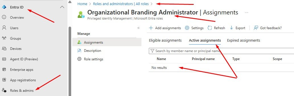
Microsoft provides a dedicated role – “Organizational Branding Administrator” – as the minimum role required to customise company branding. That role exists so you don’t have to hand out Global Administrator just to upload a logo or background.


CalderCloud leans on that design. Branding changes are made with the smallest possible set of rights:


  • If someone only needs to work on branding, they get the organisational branding role, not Global Admin.
  • If a more powerful role is temporarily required (e.g. in a very small team), that elevation is time-bound, recorded and rolled back.

The mindset is simple: nobody should hold full tenant power just to change an image.


Ownership model: who decides, who changes, who explains

To keep accountability clean, CalderCloud deliberately separates three kinds of ownership.

  • Decision ownership: sits with an IT Lead or Senior Management. They decide what a “legitimate CalderCloud sign-in” should look like, set the guardrails (subtle, consistent, accessible, reversible), and give the final “yes” or “no” to changes.
  • Execution: sits with a sysadmin or tenant admin who actually has the right Entra role. They apply the change via UI or PowerShell; and are responsible for testing it with test accounts, checking for regressions, and documenting what they did.
  • Communication ownership: is usually shared between IT and People/HR. They decide whether a change is visible enough to warrant comms, what to say about it, and how to brief the service desk so frontline support isn’t blindsided.


When those roles are blurred, you get the classic mess: “someone in IT changed it, nobody knows why, and now users are nervous.” CalderCloud’s model exists to avoid exactly that.


Change control: small record, big reassurance

Branding doesn’t go through a massive CAB process, but it does go through lightweight change control. The record is deliberately short so it gets used instead of ignored.


For every sign-in branding change, CalderCloud records:

  • What changed – logos, background, layout, text, CSS (if applicable.)
  • Why it changed – a one-sentence reason that will still make sense in six months.
  • Who approved it – the decision owner, by name or role.
  • Who implemented it – the executor who actually pressed the buttons.
  • When it happened – date/time, so incidents can be correlated.
  • How to roll back – where the previous assets and settings are stored, and what “known good” looked like.

That record is the bridge to Checks, gotchas, rollback and alternatives; later in this post – when things go wrong, you have something concrete to revert to, not just a vague memory of “what it used to look like”.

What this means for you

From an end user’s perspective, all of this governance should show up as predictability.

If the sign-in experience changes, it should be because CalderCloud has deliberately decided to change it, not because someone was experimenting; if the change is large enough to be noticeable, it should either be explained ahead of time, or at least feel calm and intentional when you see it.


You are allowed to be cautious. If a new sign-in look feels wrong – an unexpected logo, odd colours, or wording that doesn’t sound like CalderCloud – the safe response is to pause and use the official help route, not to push through on instinct. That’s a security habit and a self-protection habit; governance exists to back you up, not make you feel silly for questioning things.

The decisions only you can make

As an IT Lead or service owner, you carry the responsibility for how sign-in changes happen and how they’re justified.

You decide:

  • which roles are allowed to approve branding changes, and which simply execute them
  • what counts as a “material” change that needs communication, and what can be considered a minor refinement
  • how you measure the impact – for example:
    • are “is this legit?” calls to the service desk going down?
    • are first-day onboarding issues decreasing?
    • are there fewer wrong-account confusion incidents?


You also own the uncomfortable board-level question: “Who changed our sign-in page and when?


If that question is hard to answer, the governance pattern isn’t strong enough yet.

How to work without creating future pain

If you’re the person actually logged into the Entra admin centre, this section is about protecting both the tenant and your future self.


You:

  • work with the “Organizational Branding Administrator” role (or similarly scoped rights) instead of Global Admin for routine branding work
  • follow the guidance in the next sections: prepare assets, capture current settings, test with dedicated test accounts before impacting real users, and store rollback notes where the whole team can find them
  • avoid “quick fixes” made directly in production during live incidents – any emergency change still needs to be written down and reviewed later


Done well, this means you can improve the sign-in experience without leaving behind mystery configuration that nobody wants to touch next year.

This is the last section where we don’t touch the tenant.


I always treat this section as a design and decision workshop: you decide what “CalderCloud at sign-in” should look and feel like, which assets you’ll need, how you’ll store and version them, and what rules will stop this turning into a future mess.


The following section is where those decisions get implemented in Microsoft Entra. Here, we stay in planning mode.


Purpose: a small, deliberate branding pack

The aim is to end up with a small, stable set of assets and rules that:

  • make the sign-in experience recognisably CalderCloud
  • respect accessibility and mental health (calm, low-noise, legible)
  • are easy to export into Entra’s required formats (PNG/JPG, specific sizes)
  • are version controlled and reversible – we can go back to a known good state without guesswork

We’re not configuring anything yet. We’re answering:


“When we do configure Company Branding, exactly what are we uploading and why?”


The branding pack contents

CalderCloud was designed to work with a minimum viable set of assets rather than a sprawling folder of variations. The idea is to make it simple to keep things consistent over years, not weeks.


Branding Pack Register


Asset

Purpose

Source format

Entra upload format

Design rules

Versioning / storage

Logo – Primary (banner)

Main identity mark on sign-in form

SVG (vector)

PNG (e.g. 245×36)

Simple, high contrast, no tiny detail; works on light backgrounds

Source in “Branding\Master”; exports in “Branding\Entra”; filenames include version/date

Logo – Square

Icon-style identity for tiles/favicons/dark themes

SVG

PNG (e.g. 240×240, light + dark variants)

Bold shapes, legible at small sizes; avoid thin lines

Same as above; suffix -light / -dark as needed

Background / illustration

Calm legitimacy cue behind sign-in

SVG / high-res PSD

PNG or JPG (1920×1080, within size limits)

Low-noise, no embedded text, no fake UI; works behind form and on poor screens

Store master + “Entra” export; keep a plain fallback version

Favicon

Tiny tab icon for browsers

SVG

PNG (32×32, size cap)

Very simple mark; must be recognisable at 32×32

Keep with other exports; name clearly (CalderCloud_Favicon_32x32_v1.png)

Sign-in page text (copy)

Short reassurance + help pointer

Text (as agreed in the charter doc)

Pasted as text in Entra

Durable, non-alarming, no step-by-step instructions

Stored with approval history and dates

Branding pack register

Governance + rollback spine

This table

N/A

Always updated when assets change

Lives alongside tenant runbooks and Post 5 artefacts


Key pattern:

  • Design/master: vector (SVG) so assets are device-independent and easy to re-export.
  • Implementation/export: PNG/JPG in Entra’s required sizes and file size limits.
Palette and accessibility rules

CalderCloud’s colours are not guesswork. The baseline palette is defined, approved and is treated as the single source of truth for tenant colours.


This section is not about inventing new colours; it’s about deciding how to use the approved palette at sign-in so the experience is calm, legible and low-stress.


CalderCloud’s rules are deliberately simple:

  • Backgrounds at sign-in must use tones from the approved palette in a way that stays calm and low-noise – no harsh gradients, no high-energy patterns behind the form.
  • Text, form elements and logos must always have strong contrast against whatever background they sit on, when rendered using the palette colours on real screens.
  • Logo treatments chosen for Entra must remain recognisable when rendered in the palette on small, slightly fuzzy displays – no ultra-fine detail that disappears.
  • Accents from the palette (stronger highlight colours) are used sparingly, and never as the only way of signalling meaning.

In practice, this section includes a quick design working session: take the colours from the approved Colour Palette, mock-up the sign-in composition, and run the “tired person on a mediocre laptop” test. If someone has to squint, re-read or second-guess what they’re seeing, the combination fails – even if it technically follows the palette.


Tenant branding file formats (what we store vs what we upload)

This is one of those details that saves future admin pain.


Microsoft’s Entra company branding supports PNG or JPG for the sign-in images (logos, background, favicon) and documents specific sizes and maximum file sizes.


CalderCloud therefore standardises on:

  • Creating a Master/source file(s):
    • Vector (SVG) stored in the design storage repo – these are never uploaded directly to Entra.
  • Entra upload exports:
    • PNG for logos and favicon (crisper edges, transparency where needed)
    • PNG or JPG for background, depending on the artwork
    • Each export sized to match current Entra guidance (e.g. 245×36 banner logo, 240×240 square, 1920×1080 background, 32×32 favicon, with the documented file size caps).


A note for new tenants: Microsoft explicitly calls out that custom CSS for company branding is not available for tenants created after 5 January 2026.


That means CalderCloud’s branding pack will not rely on CSS to be “legible”; the core experience has to work with the standard image + layout options alone.

What this planning phase is protecting you from

End users are not usually involved in this design section directly, but they are the reason it exists.


This design work is what prevents:

  • jarring, flashy sign-in designs that feel more like a marketing campaign than a workplace
  • low-contrast or busy screens that are harder to parse when you’re already stressed
  • sudden visual shifts at the front door of your working day because someone fancied “refreshing the look”

From a personal point of view, the design is about committing to a sign-in experience that is calm, predictable and kind to the brain (and eyes), before anyone starts pushing any Company Branding configuration buttons.

Deciding “what CalderCloud looks like at the door”

As IT Lead / Manager, you’re defining the pattern that will be implemented, not the pixels.


You decide:

  • which elements will be used now (just logos? logos + background? logos + background + short reassurance text?)
  • what the minimum viable branded sign-in is for the current organisational reality (e.g. if the brand is mid-refresh, you might choose a very restrained pattern)
  • how strict you want to be about accessibility and stability (no seasonal themes, no campaign messages, no frequent changes)
  • where this branding pack lives and who is allowed to update it

By the time you finish the design, you should be able to explain the branding pattern to a non-technical leader in a calm, understandable manner.

Preparing to build, without touching Entra yet

As the future implementer, your job in the design is to ensure you won’t be hacking around in Photoshop at 23:00 when implementation has started.


You focus on:

  • checking that master assets exist in vector form, and that exported PNG/JPGs are ready at the right sizes
  • confirming a versioning scheme (file names with clear version tags and dates)
  • ensuring there is a rollback set: a folder of “current live” assets that can be restored if implementation and testing discover problems
  • noting Entra constraints you’ll need to respect (formats/sizes, no CSS for new tenants, language considerations)

You’re not opening the Entra admin centre yet. You’re making sure that when you do, you’ll be copying in known-good assets, not improvising.

This is the point where you stop planning and actually touch your tenant.


Everything in the above sections has been about understanding the problem, setting principles, mapping the control surface, and designing a small, deliberate branding pack. Now we move into that actual implementation – we apply the pack to the Microsoft Entra Company Branding experience – first through the admin centre UI, then (optionally) via Microsoft Graph PowerShell so the process is repeatable and auditable.


Yes we are still in “Tenant Foundations“, so we treat this as a careful, low-blast-radius change, using test accounts first, not a big-bang rollout to real users. The next section will cover testing; and the Deployment section will handle broader implementation.

Prerequisites and safety checklist

Before anyone signs into Entra to change branding, a few things must already be true.


From Microsoft’s side, company branding requires one of these licences: Microsoft Entra ID P1 or P2, Microsoft 365 Business Standard, or SharePoint (Plan 1).


Microsoft also states that the “Organizational Branding Administrator” role is the minimum role required to customise company branding; it’s designed so you don’t have to use Global Administrator for this.


From the CalderCloud side, the following should already exist:

  • A branding pack register with the agreed logo, background, favicon and sign-in text decisions.
  • Master assets in vector form and PNG/JPG exports sized to match Entra’s requirements (e.g. 32×32 favicon, 1920×1080 background, 245×36 header/banner logos, 240×240 square logos, each within the documented file size caps).
  • At least one CalderCloud test user account (often more than one) that can be used to exercise sign-in flows without involving real staff.
  • A simple change record process/system ready to be filled in as changes are made.

Only when those are in place do we move into the Entra admin centre.

What should change, and what must not

End users don’t need to know the difference between the UI and the PowerShell route. They do, however, feel the impact of this section very directly.


Once branding is implemented (even initially just for test accounts), a CalderCloud sign-in should:

  • show a calm, familiar CalderCloud identity at the right moments in the process
  • feel stable and deliberate, not like a random theme that could change tomorrow
  • present any reassurance/sign-in page text in short, clear, non-alarming language


What must not change is:

  • the basic security behaviour – MFA prompts, Conditional Access challenges and risk-based prompts stay where they belong
  • the expectation that users can “pause and ask for help” if something looks wrong

From a mental health perspective, this section is about reducing the everyday micro-stress of “this looks unfamiliar, am I safe?” Each time someone can log in, recognise the environment and carry on without a spike in doubt, the design has done its job.

Approving the move from design to implementation

For IT Leads, this section is where design decisions become a live sign-in and branding experience. Your job here is not to write PowerShell; it’s to ensure we’re ready to go live even for test users.


Before implementation, you confirm:

  • the branding pack is approved and stored in the right place
  • licence requirements are met and the right admin roles are in place
  • the change record has been started (what/why/who/when, plus rollback notes)
  • test accounts and scenarios are defined so we’re not experimenting on first real users

You also decide when the change should be applied for the first time (for example, avoiding known busy on-boarding days) and set expectations with the service desk that “branding changes are happening in test” so early alerts are noticed and not dismissed as noise.

Configure branding in the Entra admin centre (UI) – A Step-by-Step guide

This is the “classic” route: using the Microsoft Entra admin centre to configure the default sign-in experience.


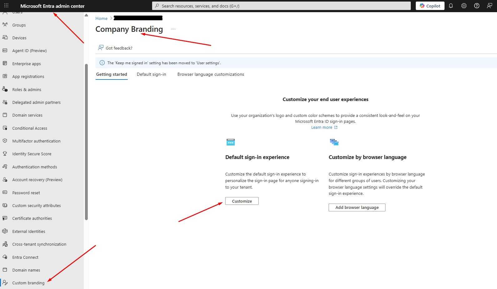
Step 1 – Open company branding

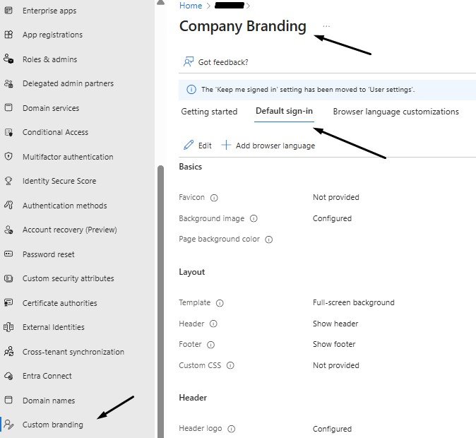
  1. Sign in to the Microsoft Entra admin centre as a user with the right role (Organizational Branding Administrator).
  2. Browse to Entra ID → Custom branding.
    • If you already have a customised sign-in experience, you’ll see an Edit button.
    • If not, you’ll see an option to create the default sign-in experience.
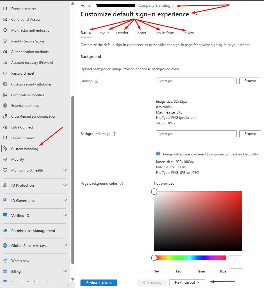
Step 2 – Basics: favicon, background image, fallback colour

On the Basics step, Microsoft’s current guidance is:

  • Favicon
    • PNG or JPG
    • 32×32 px, maximum 5 KB
  • Background image
    • PNG or JPG
    • 1920×1080 px, maximum 300 KB
  • Page background colour
    • Shown when the background image can’t load (slow connection, restricted environment).


Here, CalderCloud applies the palette decisions identified in the previous section:

  • Use the approved background image from the branding pack, not a one-off upload.
  • Choose a calm background colour from the CalderCloud palette that works even if the image never appears.


This step is mostly plumbing – but it’s plumbing that users see every day.


Step 3 – Layout: template and CSS constraints

On the Layout step you choose how the sign-in page is structured. Microsoft currently offers template choices such as full-screen or partial-screen background, and an option to upload custom CSS.


CalderCloud’s choices:

  • Prefer the partial-screen layout if the background image carries meaning; full-screen can obscure parts of it behind the sign-in box.
  • Enable header and footer only if there is a clear, accessibility-friendly reason to do so (we’ll use the header for logo in a controlled way; we avoid footer complexity where possible).

The CSS option is where the tenant’s age matters. Microsoft’s documentation notes:


Tenants created after 5 January 2026 will not have custom CSS available for company branding.


Even where CSS is available (older tenants), CalderCloud treats it as an optional enhancement, not a dependency. The core experience must be legible and accessible without CSS tweaks.


Step 4 – Header and footer (optional, used sparingly)

If you enable a header in the Layout step, the Header step lets you upload a small logo image. Microsoft’s guidance is: PNG or JPG at 245×36 px, up to 10 KB in size.


CalderCloud typically:

  • uses the primary logo here only if it genuinely adds clarity
  • avoids duplicating logos between header and banner to prevent visual clutter


The Footer step controls “Privacy & Cookies” and “Terms of Use” links and allows custom text/URL pairs. Microsoft notes that custom URLs are displayed as text and aren’t clickable in this context.


Given that limitation, CalderCloud usually:

  • keeps Microsoft’s default links, unless there is a strong regulatory reason to override them
  • avoids trying to turn the footer into a mini portal; it’s a legal tail, not a navigation bar
Step 5 – Sign-in form: logos, hint text, page text and SSPR

This step is where most of the visible branding work happens. Microsoft’s current requirements are:

  • Banner logo
    • PNG or JPG
    • 245×36 px, up to 50 KB
  • Square logo (light theme)
    • PNG or JPG
    • 240×240 px, up to 50 KB
  • Square logo (dark theme)
    • Same size/limit; optional if your logo looks good on both backgrounds
  • Username hint text
    • Optional hint before the user enters their details; not recommended if guests share the same sign-in page.
  • Sign-in page text
    • Up to 1,024 characters, Unicode; can include basic formatting (bold, italics, underline, markdown-style links).
    • Microsoft warns that hyperlinks render as plain text in native desktop/mobile clients.
  • Self-service password reset (SSPR)
    • Option to show SSPR, specify a Common URL and customise display text.
    • The SSPR link text may also appear as non-clickable text, depending on context.

Here, CalderCloud sticks to the rules set earlier:

  • Upload the banner logo and square logos from the branding pack, not ad-hoc images.
  • Keep username hint text either off or extremely simple, especially in multi-tenant/guest scenarios.
  • Use sign-in page text only for a short reassurance plus a pointer to the standard help route – no long instructions, no URLs that people are expected to click.
  • If enabling SSPR links, keep wording calm and consistent with your wider security language.
Step 6 – Review + create (and the “can’t delete default” fact)

On the Review step, Entra shows a summary of all settings. Microsoft notes that once the default sign-in experience exists, you can edit it but you can’t delete it; you can only remove custom settings and fall back to defaults.


Before selecting Create (or Save if editing), CalderCloud requires that the sysadmin:

  • double-checks that all uploads match the branding pack register (names, sizes, formats)
  • saves a copy of the current configuration details (for rollback), using the change record process
  • tests the new branding using test accounts first – the next section will outline those scenarios in detail

Apply branding via Microsoft Graph PowerShell

The UI is useful for one-off implementations, but CalderCloud wants a repeatable, scriptable path too. That’s where the Microsoft Graph PowerShell SDK comes in.


The Graph PowerShell module Microsoft.Graph.Identity.DirectoryManagement exposes Update-MgOrganizationBranding for default branding and New- / Update-MgOrganizationBrandingLocalization for language-specific variants.


Microsoft documents that these cmdlets require permissions such as OrganizationalBranding.ReadWrite.All and Organization.ReadWrite.All, either delegated or app.


A simplified example for default branding:


# Requires Microsoft Graph PowerShell SDK

# Install-Module Microsoft.Graph -Scope CurrentUser

Import-Module Microsoft.Graph.Identity.DirectoryManagement


# Connect with delegated permissions for an admin-led change
Connect-MgGraph -Scopes “OrganizationalBranding.ReadWrite.All”, “Organization.ReadWrite.All”


# Get the organisation Id (there is usually only one)
$org = Get-MgOrganization -Property Id,DisplayName
$organizationId = $org.Id


# Asset paths – these map directly to your branding pack exports
$assetsRoot      = “C:\ClientName\BrandingPack\Entra”
$bannerLogo      = Join-Path $assetsRoot “ClientName_BannerLogo_245x36_v1.png”
$backgroundImage = Join-Path $assetsRoot “ClientName_Background_1920x1080_v1.png”
$squareLogo      = Join-Path $assetsRoot “ClientName_SquareLogo_240x240_v1.png”
$squareLogoDark  = Join-Path $assetsRoot “ClientName_SquareLogoDark_240x240_v1.png”
$favicon         = Join-Path $assetsRoot “ClientName_Favicon_32x32_v1.png”

$signInPageText  = “ClientName sign-in. If something feels unexpected, pause and contact your usual IT support route.”
$usernameHint    = “name@ClientName.co.uk”


# Optional layout config – aligns with what you chose in the UI
$loginPageLayoutConfiguration = @{
  isHeaderShown = $false
  isFooterShown = $false
  layoutTemplateType = “default”
}


# Apply/update default branding
Update-MgOrganizationBranding `
  -OrganizationId               $organizationId `
  -BackgroundColor              “#??????” `
  -BannerLogoInputFile          $bannerLogo `
  -BackgroundImageInputFile     $backgroundImage `
  -SquareLogoInputFile          $squareLogo `
  -SquareLogoDarkInputFile      $squareLogoDark `
  -FaviconInputFile             $favicon `
  -SignInPageText               $signInPageText `
  -UsernameHintText             $usernameHint `
  -LoginPageLayoutConfiguration $loginPageLayoutConfiguration

Disconnect-MgGraph


The point is not that every tenant must use this exact script, but that branding changes can be version-controlled and replayed rather than manually re-clicked each time. It also makes rollback more reliable: you can check in “previous known-good” parameters alongside the current ones.


For localised experiences, Microsoft’s New-MgOrganizationBrandingLocalization and Update-MgOrganizationBrandingLocalization cmdlets follow the same pattern, taking properties such as backgroundColor and signInPageText in a hashtable.


CalderCloud only adds localisations where there is a clear language need, because each localisation adds operational overhead and more places to keep in sync.

Early-stage tenants and test-only implementation

Because this post happens in the “Tenant Foundations” phase, CalderCloud often has only a handful of real users – or none – when this section is first applied.


In that context, implementation is usually implemented in two passes:


  1. Foundational implementation for test users only
    • Apply branding via UI/PowerShell.
    • Use dedicated test accounts to exercise the flows.
    • Capture screenshots and observations for the next sections testing plan.
  2. Later re-validation before broad rollout
    • When real users start onboarding, briefly re-check the branding behaviour and wording with the current security/onboarding story.
    • Confirm nothing in the experience has drifted away from the principles defined and approved earlier in this post.


That way, the implementation “phase” lays a solid foundation without locking you into something that can’t flex when the tenant grows.


This section is now the operational bridge between your design decisions and the testing plan. It’s where CalderCloud proves that the tenant can present a trustworthy, calm sign-in experience in a controlled way before exposing it to real people at scale.

Testing branding still in “Tenant Foundations”, is about protecting both the tenant and the people who will eventually use it.

If we test well at this stage, the tenant launches with a sign-in experience that already feels legitimate, predictable and calm. Early users can spend their mental energy learning Microsoft 365, not wondering whether they’ve just put their password into the wrong place. Support sees fewer “is this real?” tickets, and trust in the platform builds faster.


If we don’t test, or test badly, the first real users become guinea pigs. They hit broken process flows, confusing account choices or visually jarring pages. For some that’s just a nuisance. For others, especially anyone already carrying stress or anxiety, it becomes one more reason to dread logging in.


This section exists to stop that. It doesn’t aim for perfection; it aims to remove obvious friction and doubt before anyone outside the project team has to live with our decisions.

How CalderCloud tests sign-in branding

CalderCloud keeps the test population small but realistic:

  • a clean test account that only exists in this tenant
  • a mixed-identity test account that also has a personal Microsoft account
  • at least one device or VM representing a modest laptop screen (nothing fancy), plus at least one different browser/OS combination so we’re not accidentally only testing “Edge on Windows on an admin laptop”


Those accounts are used to walk through a focused set of journeys. To avoid the “everyone tests in a completely different way” situations; each scenario has light pre-requisites and setup notes captured directly in the test matrix.

CalderCloud sign-in branding test matrix (foundations pass)

Test Number

Test account

Scenario

Pre-req / setup notes

Device / browser / condition

What we’re checking

Result / notes

CC_001

CC-Test-01 (clean)

First sign-in after branding change

Account created in earlier Tenant Foundations posts; no prior sign-ins to M365; use a new or cleared browser profile

Windows laptop or VM, Edge (or another mainstream browser)

Does the page clearly look like CalderCloud? Any hesitation about legitimacy at first sight?

e.g. “Looked clean, logo obvious, no hesitation.”

CC_002

CC-Test-01 (clean)

Repeat sign-in with remembered account

Same device as test number CC_001; allow browser to remember the work account

Same device/browser as above

Does the remembered-account path still show CalderCloud branding at the right point? Any confusion about which account you’re in?


CC_003

CC-Test-02
(work account +
personal account i.e.
initial.surname
@outlook.com)

Account chooser then sign-in

Test identity that also has a personal Microsoft account signed into the browser

Personal laptop, non-admin profile; use at least one non-Edge browser (Chrome/Firefox/Safari)

Can the user quickly pick the work account? Does branding reassure them they’re in the CalderCloud tenant and not their personal space?


CC_004

CC-Test-02 (work acc. + personal acc.)

MFA / Conditional Access prompt during sign-in

MFA / CA already configured in earlier Tenant Foundations posts; test account enrolled for MFA

Same device/browser as CC_003, with second factor (phone/app) available

Do security prompts feel like part of the same CalderCloud story, or like a random jump scare on top of new visuals?


CC_005

CC-Test-03 (any)

SSPR or “Forgot my password” entry point

Self-service password reset enabled in the tenant as per earlier posts; test account meets SSPR policy

Browser you expect users to use most (Edge/Chrome/Safari/Firefox)

Does the password reset path feel coherent with the branded sign-in page, or like a completely different, slightly suspicious experience?


CC_006

CC-Test-03 (any)

“Bad day” accessibility pass

Any of the test accounts; no special config beyond “don’t make conditions ideal”

Lower-end laptop or VM, brightness turned down; awkward lighting; test one non-Windows device (Mac or iPad) if available

Are text, form elements and logos still legible? Does the background make the page harder to parse when you’re tired or under strain?


You don’t need every hardware permutation under the sun. The aim is to sample:

  • at least two browsers (for example Edge plus Chrome/Firefox/Safari)
  • at least one non-admin machine, close to what normal staff actually use
  • at least one non-Windows experience if the organisation has any Mac/iOS presence at all

If the team genuinely has no access to a Mac or iOS device, CalderCloud simply notes that limitation honestly in the testing notes rather than pretending it is covered.


The Result / notes column is where the actual in person testing side shows up. Testers write what actually happened and how it felt, not just “Pass/Fail”. Comments often are best worded similar to:

  • “I kept double-checking the address bar; the page felt ‘too different’ from what I’m used to.”
  • “Text was readable but looked washed out on my older laptop.”
  • “I didn’t know who to contact when the MFA prompt surprised me.”


Those notes are where the mental health and cognitive load triggers appear. A technically “perfect” sign-in that leaves people uneasy is not considered a success.


When this matrix has a few honest rows completed, we can answer two questions:

  1. Coverage: have we actually exercised the main ways people will hit this sign-in experience?
  2. Impact: has anything in the current design clearly added confusion or stress?


If either answer is “no”, branding goes back to the Designing and Implementation of a Branding Pack sections for adjustment before anyone talks about rollout.


A quick note on VMs: if a sysadmin doesn’t know how to create a Windows test VM (or equivalent), that’s fine. Use any spare device or test machine you already have. If there really isn’t one, record that constraint. The important part is avoiding tests that only ever run on the pristine admin machine used to build the branding.


Recording results and who owns them

Testing only helps if the evidence is easy to find later.

CalderCloud keeps the test matrix alongside:

  • the branding pack, and
  • the branding change record system.

In whatever workspace that holds tenant charter documentation (SharePoint, Teams, DevOps, Git, etc.). The tooling can change; the co-location should not.


Responsibility is clear:

  • Sysadmin / Tenant Admin
    • ensures any technical pre-requisites are met (e.g. MFA and SSPR configured in earlier Tenant Foundations posts)
    • runs the tests with the agreed accounts, devices and browsers
    • fills out the test matrix and updates the branding change record with a short testing summary (when testing was done, which scenarios were covered, any key findings)
  • IT Lead / Management
    • reviews the test matrix and the summary
    • decides whether branding is “good enough for targeted rollout” or needs another round of design/implementation work
    • captures any known rough edges or caveats as explicit entries for the “checks, gotchas and rollback” section
  • Pilot users
    • once real users have been added to the tenant, a small pilot group eventually replaces some of the localised test runs
    • their experiences are logged in the same place, using the same table matrix model, so there is one continuous trail from lab testing through to live rollout


The outcome of this section plugs directly into the rest of this Post:

  • The Deployment approach (next section) uses the testing summary to decide who should see the new branding first, when, and with what expectation-setting.
  • Checks, gotchas and rollback section (later in this post) collects any issues or caveats discovered here so future admins don’t accidentally rediscover the same problems from scratch.


When the Testing section is complete, CalderCloud isn’t claiming that nobody will ever be confused again. It is claiming something much more honest and much more useful:


“We’ve deliberately exercised the main sign-in journeys in conditions that resemble real life, captured how they behaved and how they felt, and fixed anything obviously confusing or stressful before exposing this to a wider audience.”


That’s the only sensible starting point for the calm rollout work.

By this point CalderCloud has done the groundwork:

  • we understand the trust problem
  • we’ve agreed principles
  • we know exactly what Entra branding can and can’t touch
  • we’ve sorted ownership and change control
  • we’ve designed a small, deliberate branding pack
  • we’ve implemented it carefully
  • and we’ve tested it with realistic journeys


This section is about how all of that meets real employees.


A sign-in change that simply appears one morning with no warning is a trust event, not just a design change. Some people will shrug and move on. Others will, quite reasonably, wonder whether something has been compromised. For anyone already carrying stress or anxiety, that “has someone hacked this?” moment is not trivial.


CalderCloud’s rollout rule is simple:

  • No surprise theatre.
    People should either be expecting the change, or experience it as calm and obviously intentional.


Rollout is therefore treated as another part of Tenant Foundations, not an afterthought.


Planning a small, calm rollout

CalderCloud uses a very lightweight ringed rollout. This isn’t a giant enterprise change framework; it’s a way to avoid flipping branding on for everyone at once with no feedback loop.


We effectively already completed Ring 0 in the previous “Testing” section: branding validated with test accounts only. This section adds a couple of very human rings on top.


Ring

Who’s in it

Purpose

Entry criteria

Exit criteria

Ring 0 – Tenant Foundations

Test accounts only

Prove basics work; no obvious confusion or stress in lab conditions

implementation complete; test matrix run and reviewed

Matrix shows acceptable behaviour; known issues documented

Ring 1 – Project team & IT

Tenant admins, IT team, core project members

Experience the change as everyday users; catch sharp edges before anyone else sees them

Ring 0 passed; change record updated with test summary

No new major issues after a few days of normal use

Ring 2 – Friendly pilot

Small, willing group of real users (champions, early adopters)

See how branding lands with people who weren’t involved in building it

Ring 1 stable; service desk briefed; pilot group pre-briefed

Feedback shows no trust-breaking issues; minor tweaks logged if needed

Ring 3 – Wider rollout

The rest of the tenant’s user base

Make the new sign-in the normal experience

Ring 2 feedback reviewed; agreed fixes applied; comms prepared

Branding treated as “the way CalderCloud sign-in looks” going forward


In an early-stage tenant, Rings 1 and 2 might be tiny for a while. That’s fine. The point is not how many people sit in each ring; the point is that we don’t jump straight from “test account only” to “entire organisation” in one move.


For a Sysadmin, this ring plan mostly turns into timing and observation. Ring 1 often coincides with “turn it on” in a new tenant, because only the project and IT crowd are really using it yet. Ring 2 is less about extra configuration and more about deliberately listening to a small, willing group of real users who weren’t involved in the build. Ring 3 is when you treat the branding as fully live, and any future changes have to go back through ownership and permissions, implementation, and testing sections for every change.


For an IT Lead or Manager, rings are about risk appetite and confidence. They provide a simple way to answer questions like:

  • “Have enough employees seen this that we’re not gambling with the whole organisation?”
  • “If a senior leader’s first experience of the new sign-in happens in Ring 3, are we comfortable that Rings 1 and 2 gave us enough warning if something was wrong?”


For end users, the rings should be invisible. Nobody should feel like they’re part of an uncontrolled experiment. They should either:

  • have a small, clear heads-up that “your sign-in will soon look more like CalderCloud – here’s what to expect”, or
  • encounter a new sign-in that feels calm, coherent and obviously intended.


A rollout plan that people don’t notice is usually a sign that it’s doing its job.


Communicate, support and listen

Rollout fails when people are surprised and then left alone with their questions. Here it is about making sure that what changes, what doesn’t, and where to get help are all clear, and that someone is paying attention afterwards.


CalderCloud keeps the message short. A typical pattern is a brief pre-change note (to the pilot and then to the wider base) plus one or two post-change reminders in existing channels.


The core content covers four things:

  • What’s changing
    A straightforward description: “The sign-in page for CalderCloud services will start to look more like CalderCloud (logo, colours, background).”
  • What’s not changing
    Reassurance that this is not a secret security change:
    “How you sign in, how your password works, and how security checks like MFA behave are not changing because of this.”
  • Why we’re doing it
    A clear purpose:
    We’re doing this so it’s easier to recognise a legitimate CalderCloud sign-in and know you’re in the right place.
  • What to do if something looks wrong
    The critical bit for both security and mental health:
    If the sign-in page ever looks very different to this, or you’re not sure it’s genuine, pause and contact [named support route]. You will never be criticised for asking if something looks odd.


That last line is intentional. Some people already feel silly calling the service desk about “just a login screen”. CalderCloud wants them to know caution is expected, not embarrassing.


While that message is being prepared, support and the service desk need their own short briefing. They don’t need a huge runbook; they do need:

  • a simple screenshot or description of the new sign-in page, with key cues highlighted
  • an idea of when it will appear and which rings are live
  • a calm script for common questions (e.g., “Is this real?”, “Why does it look different?”)
  • clear criteria for what counts as a red flag that should be escalated quickly (for example, screenshots that don’t match the official pattern)


For the service desk, this is as much about tone as content: acknowledge that the caller’s caution is sensible, reassure them if things look normal, and escalate if they don’t. The whole rollout assumes that nobody gets punished for being careful.


Rollout also has a listening phase. For at least a short period after Ring 3, CalderCloud treats branding as “under observation”. A very simple “signals” table is enough:


Signal

Where it shows up

What it might mean

Action

Increase in “is this legit?” tickets

Service desk logs, Teams chats, email

People aren’t yet trusting the new look; visual design or comms may not be clear enough

Review screenshots and wording; consider a small tweak to branding or a clearer reminder message

Reports of text being hard to read on certain devices

Tickets mentioning “can’t read”, “too faint”, “blurry”

Contrast or background choices are marginal on some hardware

Cross-check against palette and accessibility rules from the design section; adjust assets and re-export if needed

Complaints about “too many changes” or “it looked different yesterday”

Feedback from pilot or wider users

Branding pattern may be changing too often or clashing with other changes

Slow down visual changes; reinforce stability in sign-in design

Confusion about where to get help

Users asking colleagues instead of using official routes

Help route is not clear enough at sign-in or in comms

Refine sign-in text and comms to make the support front door explicit


This doesn’t need to be a big dashboard. A short checklist reviewed weekly for the first few weeks is enough to spot trends. If there are signs of friction, CalderCloud treats them as discovery, not user failure:

  • maybe the background is too busy on older screens
  • maybe the sign-in text isn’t as clear as we thought
  • maybe the help route needs to be more prominent in the places people actually look


Any meaningful findings from this listening phase are added to the same change record process used earlier in this post: a short summary of what surfaced, what was changed (if anything), and who signed it off. If an issue points to deeper constraints rather than a quick fix, it becomes an entry in the “checks, gotchas and rollback” section so future admins don’t rediscover the same problem the hard way.


When deployment is done well, the new sign-in doesn’t become a talking point. It quietly settles into the background of people’s working day, doing its real job: signalling legitimacy, reducing doubt, and leaving people with more mental energy for work that actually matters.

Everything up to this section has been about reducing doubt. But what happens when doubt still wins.?


Even with good branding and a calm rollout, people will sometimes stop and think:

  • “Is this screen really ours?”
  • “Why am I seeing this prompt?”
  • “Who do I ask about this without looking stupid?”


If they don’t know where to take those worries, they either gamble (“I’ll just click through and hope it’s fine”) or quietly get stuck. Both are bad for security, adoption and mental health.


There’s also a nasty circular trap that IT often forgets: if you can’t sign in, then anything that lives behind sign-in – email in Exchange Online, an internal help site in SharePoint, a ticket portal in the tenant – might be unreachable. So any support plan that says “go to this intranet link” or “raise a ticket in the portal” has just failed at the precise moment it matters.


So “how to get help” has one job:

Define a clear, simple front door for help with sign-in issues that has at least one route that doesn’t depend on being signed in, and make sure it’s visible in the places that matter – especially sign-in and password reset branding.


We’re not building the entire IT support model here. We’re setting the minimum bar at the tenant boundary so nobody facing a dodgy-feeling sign-in is left thinking “no idea who to ask”.

One front door, foundations surfaces (including out-of-band)

Behind the scenes, your business may have several support teams. To an end user, there should be one clear concept for sign-in and account worries – for example, “CalderCloud IT Service Desk”.


At Tenant Foundations stage we assume you at least have:

  • a phone number and/or shared email for IT support, and
  • real people who answer it, from outside the M365 sign-in boundary.


We use that as the front door and wire it into the things we can already touch:

  • Entra sign-in page text – the short “Sign-in page text” block at the bottom of the sign-in page that Microsoft explicitly allows for helpdesk information or legal statements.
  • SSPR “Contact your administrator” / custom helpdesk link – the link on the password reset portal that can be customised to point at a helpdesk email or URL users already know.
  • A basic direct contact route – a phone number (and optionally an email) that people can use even when they’re completely locked out of the tenant.
  • A service desk one-pager – a single A4-style crib sheet for service desk agents so their responses are consistent, calm and aligned with everything relating to this post.


Later topics will plug this same front door into richer opportunities (welcome emails, SharePoint help sites, support service portals). In this post we just make sure the sign-in and reset boundary isn’t a dead end.


A small table keeps the foundations view concrete:


Surface / artefact

What the user or agent sees

How we reference the help front door

Who owns it (at this stage)

Entra sign-in page text

Short text under the sign-in form

One calm sentence using the agreed name, e.g. “If something looks unusual, contact the CalderCloud IT Service Desk on [phone]. If you can access email, you can also use [address].”

Sysadmin (via Entra company branding “Sign-in page text”)

SSPR “Contact your administrator” / custom helpdesk link

Contact your administrator” link or custom helpdesk link in the password reset portal

Custom helpdesk email or URL set to the same front door (helpdesk email or support URL users already know). Microsoft recommends pointing it at a support route users recognise rather than the default “email some admins” behaviour.

Sysadmin / authentication admin (Password Reset > Customization > Custom helpdesk email or URL)

Basic helpdesk contact route (direct)

Phone number and/or shared email address users can use from a personal device

Used in all wording as the practical “how”: “Call the CalderCloud IT Service Desk on [phone]. If you can access email, you can also use [address].” Must be usable even when the tenant is unavailable or the user is locked out.

IT Lead + support owner (choose the route, keep it stable, and document it outside M365 where needed)

Service desk one-pager (A4 crib sheet)

A single page each agent can keep on-screen or at their desk

Clear script and checks: how to respond to “is this legit?”, how to reassure, which visual cues to ask about, when to escalate. Same language as sign-in/SSPR text, plus a reminder that callers may not be signed in anywhere.

Service desk lead (with IT Lead input)


Critically, at least one of those routes (usually the phone number) must work from:

  • a personal mobile
  • home broadband
  • and even when the tenant or the user’s account is having a very bad day.

Everything else is layering.


Reusable wording set (for Entra, SSPR and support)

To stop every team inventing its own language, CalderCloud agrees a small wording set that can be reused across:

  • Entra sign-in page text
  • SSPR help/contact text
  • the service desk one-pager
  • later, welcome emails and help pages


Entra sign-in reassurance (Sign-in page text)


“This is the CalderCloud work sign-in page.
If something looks very different to this, or you’re not sure it’s genuine, pause and contact the CalderCloud IT Service Desk on [phone]. If you can access email, you can also use [address].”


This uses the sign-in page text field exactly as Microsoft describes it: a short, public message where you can include helpdesk information, within the character limit and without any sensitive detail.


SSPR help nudge (Contact link / helpdesk text)


“Forgot your password or locked out?
If this page doesn’t look like you expect, or you’re not sure you should be here, contact the CalderCloud IT Service Desk on [phone] before continuing. If you can access email, you can also use [address].”


Here we’re using the “Contact your administrator” / Custom helpdesk email or URL behaviour: when customised, it sends users either to a webpage or to a chosen helpdesk email, and Microsoft explicitly recommends pointing it at a support route users are already familiar with.


Service desk one-pager intro (for service desk agents)


Handling “Is this sign-in legit?” or “I can’t sign in” calls


When someone calls or emails because a sign-in screen looks different, or they can’t sign in, your first job is to thank them for checking. They’re doing the right thing.

  1. Ask what they see, using the official CalderCloud sign-in screenshot as a reference.
  2. If it matches, reassure them that the page is genuine and remind them they can always check in future.
  3. If it doesn’t match, or you’re unsure, treat it as a potential security issue and escalate according to the incident process – do not tell them to “just try it and see”.


Remember: many callers will be using a personal phone or non-work device because they can’t get into CalderCloud. Don’t ask them to open internal sites they can’t reach.


Nobody should be criticised for asking if something looks odd. We want people to feel safe raising concerns.


The one-pager can then add any local details your support model needs (ticket categories, escalation paths, on-call numbers), but this opening defines tone, expectations, and the “you may not be signed in anywhere” reality.


Across all three, the design model is the same:

  • name the page or situation (“CalderCloud work sign-in page”, “password reset”)
  • normalise doubt (“if you’re not sure…”)
  • point to the front door by name and a phone route that doesn’t depend on sign-in
  • treat email as a secondary route, only “if you can access email”
  • avoid expecting users to diagnose phishing or configuration mistakes alone
What this planning phase is protecting you from

End users are not usually involved in this design section directly, but they are the reason it exists.


This design work is what prevents:

  • jarring, flashy sign-in designs that feel more like a marketing campaign than a workplace
  • low-contrast or busy screens that are harder to parse when you’re already stressed
  • sudden visual shifts at the front door of your working day because someone fancied “refreshing the look”

From a personal point of view, the design is about committing to a sign-in experience that is calm, predictable and kind to the brain (and eyes), before anyone starts pushing any Company Branding configuration buttons.

Deciding “what CalderCloud looks like at the door”

As IT Lead / Manager, you’re defining the pattern that will be implemented, not the pixels.


You decide:

  • which elements will be used now (just logos? logos + background? logos + background + short reassurance text?)
  • what the minimum viable branded sign-in is for the current organisational reality (e.g. if the brand is mid-refresh, you might choose a very restrained pattern)
  • how strict you want to be about accessibility and stability (no seasonal themes, no campaign messages, no frequent changes)
  • where this branding pack lives and who is allowed to update it

By the time you finish the design, you should be able to explain the branding pattern to a non-technical leader in a calm, understandable manner.

Preparing to build, without touching Entra yet

As the future implementer, your job in the design is to ensure you won’t be hacking around in Photoshop at 23:00 when implementation has started.


You focus on:

  • checking that master assets exist in vector form, and that exported PNG/JPGs are ready at the right sizes
  • confirming a versioning scheme (file names with clear version tags and dates)
  • ensuring there is a rollback set: a folder of “current live” assets that can be restored if implementation and testing discover problems
  • noting Entra constraints you’ll need to respect (formats/sizes, no CSS for new tenants, language considerations)

You’re not opening the Entra admin centre yet. You’re making sure that when you do, you’ll be copying in known-good assets, not improvising.

This is the moment this post has been quietly building towards.


Back at the beginning of this post, we sketched the first 15 minutes in CalderCloud as a destination: what a calm, trustworthy sign-in should feel like for a new person. By now, the above sections have given us all the pieces that make that possible. This section walks through that experience again in more detail, this time with the wiring exposed and a checklist we can actually run in the real tenant.


Everything so far has been about:

  • making the sign-in page look and feel like CalderCloud
  • making sure only the right people can change it
  • designing and implementing the branding pack
  • testing it in the lab
  • rolling it out calmly
  • and giving people a clear place to go when they’re worried


This is where we step back and asks a simple, real-life question:


“What does the first proper day inside this tenant feel like for a new CalderCloud person?”


We’re still in Tenant Foundations, so this might be just a handful of people at first: a pilot user, a champion, an early hire. That’s exactly why their experience matters so much. The first few people to live with the tenant will quietly define what “normal” feels like for everyone who comes after them.


A short story: Amira’s first day

To make this concrete, let me introduce you to a fictional – but realistic – character and her first day. 


Welcome to our new colleague Amira.


Amira is at home on a Tuesday morning, using her own laptop. She’s had an offer letter and a basic welcome pack – nothing fancy yet, just enough to tell her she’ll be using “Microsoft 365” for work. She’s excited, but she’s also carrying normal first-day nerves: new job, new systems, new people. Like a lot of people, she’s also slightly anxious about “doing technology wrong”.


Her first task is to sign in.

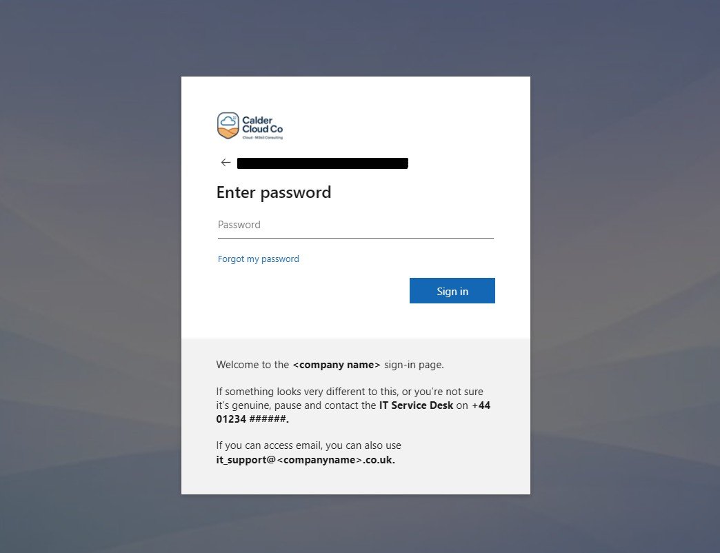
  1. She opens the link she was given. The sign-in page appears with the CalderCloud logo, calm background and the short reassurance text. It isn’t shouting at her; it quietly says this is the CalderCloud work sign-in page, and reminds her that if it ever looks wildly different, she can ring the service desk.
  2. She enters her work email. The next screen keeps the same overall look and feel. She follows the instructions to register her account on the MFA application (remember we ensured security is enabled) on her phone and then gets an MFA prompt, but it doesn’t feel like a random ambush; the language matches what she’s seen in pre-joining info, and the branding looks consistent enough that her brain doesn’t have to work overtime to decide if it’s legitimate.
  3. For a moment, she hesitates. Is this really the right place? She glances back at the reassurance text and sees the same CalderCloud IT Service Desk name and phone number she has in her welcome pack. That tiny match is enough to settle the doubt. She completes the MFA prompt.
  4. She lands in Microsoft 365 proper – homepage, Outlook, Teams, whatever the default application list is. Later topics will shape what those look like. For now, the important thing is that she has got through the front door without feeling tricked, foolish or unsafe.


Later that week, Amira forgets her password. She clicks “Forgot my password?”. The SSPR page appears. It looks consistent with the sign-in page and has another small piece of text:


“If this page doesn’t look like you expect, or you’re not sure you should be here, contact the CalderCloud IT Service Desk on [phone] before continuing.”


She recognises the same support name and number. She still feels annoyed with herself for forgetting, but she doesn’t feel abandoned or at risk. She knows that if anything looks wrong, there’s a safe, direct number to call from her personal phone.


Later topics in this series will do more work on what Amira sees after sign-in – her home experience, apps and guidance. In Tenant Foundations, we’re just making sure the front door and immediate recovery journey feel safe, intentional and kind to a real world person on a real device.


First user experience checklist

Stories are useful, but CalderCloud doesn’t want to rely on gut feeling alone. Whenever the first real users start using the tenant (or a new pilot group joins), it uses a simple first-experience checklist to capture what actually happens.


Stage

What the user does

What we expect them to see and feel

Who observes / captures feedback

Notes

1. First sign-in from a non-work device

Uses link from welcome info to sign in from a home PC or personal laptop

Sign-in page clearly looks like CalderCloud; reassurance text visible; URL and visuals feel legitimate. On their actual screen – not ours – it’s easy enough to read and understand even if they’re tired, anxious or using an older monitor. They know who to call if unsure.

Sysadmin or IT Lead doing a short 1:1 walk-through with the first few users, or asking them to narrate their experience

Capture phrases like “I wasn’t sure at first, but the text helped” or “I liked that it told me who to call”.

2. First MFA or extra security prompt

Encounters MFA / Conditional Access during sign-in

Security prompt feels like part of the same CalderCloud story: the branding still makes it feel like “work”, the wording isn’t alarming, and the flow doesn’t overload them with decisions. They may be cautious, but not panicked.

Security owner / IT Lead, through short follow-up chats with early users

Note if people seemed panicked, confused, or surprisingly chilled. Adjust MFA wording/comms later if needed.

3. “Something looks odd” moment (if it happens)

Spots a sign-in or reset screen that looks different, or isn’t sure

Uses the out-of-band help route (phone from personal mobile) rather than guessing. Feels thanked for checking, not blamed or rushed.

Service desk lead reviewing early calls, plus anecdotes from IT

Log at least one example call in the change record: what the caller said, how the agent replied, what we learned.

4. First password reset via SSPR

Uses “Forgot my password?” and completes the flow

SSPR page looks coherent with sign-in branding; the CalderCloud name and help text appear; on a real device the steps are clear, even if someone is flustered or not very confident with tech. They know who to call if they get stuck.

Sysadmin / authentication owner reviewing a couple of real reset journeys with users

Check whether the wording and branding actually reassured people or just sat in the background.

5. First week “how does the front door feel?” check-in

After a few days of normal use

User can describe, in their own words, what the “real” CalderCloud sign-in looks like (roughly), and what they’d do if it looked wrong. They don’t report sign-in as a daily stress point.

IT Lead or product owner through a short chat or one-question survey with early users

Collect quotes. They’ll be invaluable later when explaining the design and decisions to stakeholders.


In Tenant Foundations you don’t need to run this checklist for hundreds of people. It might be five pilot users, or even just IT staff deliberately wearing their “normal user” hat. The point is that somebody actually asks and writes the answers down.


CalderCloud keeps these notes with the rest of the Tenant foundation charter documentation:

  • alongside the branding pack
  • the implementation details
  • the test matrix
  • and the rollout and help records

so that the story of “how this feels for real people” lives in the same place as the technical change, not in somebody’s memory.


By the end of of this post, Tenant Foundations has done something many tenants never manage:

  • the front door looks and feels like CalderCloud,
  • the help route is clear and reachable even when sign-in isn’t, and
  • the first real employees through the door have been listened to, not just handed a link and left to sink or swim.

The next and final section will gather up the sharp edges, odd behaviours and “you’ll thank yourself later” details into a set of checks, gotchas and rollback options – so day 5 leaves future admins a map, not just a story.

For an End User, the first experience should feel:


  • Predictable – sign-in pages look the same each time, not like a new experiment every week.
  • Legible – the page and prompts are readable on their hardware, not just on a lab machine. They don’t have to squint or guess.
  • Safe to question – they know roughly what the real sign-in looks like, and they know that pausing and calling the service desk is normal, not something they’ll be mocked for.

From their point of view, success looks like: “I know the front door, and I know who to ring if it ever looks wrong.”

For an IT Lead or Manager:

This section  is a structured chance to listen and adjust:


  • sit in on one or two first sign-ins, or at least read the notes from those who did
  • notice where users hesitate, not just where they fail outright
  • decide whether any confusion points are big enough to warrant a tweak now, or simply something to watch over time

Their job is to bridge the gap between “we designed this” and “people actually live with this every morning”. Success here is:


“We’ve heard from the first humans through the door and used that feedback wisely, not defensively.”

For a Sysadmin, this section is mainly about closing the loop and anchoring it in the record:


  • checking that the experience users describe matches the configuration they’ve set up (branding, sign-in text, SSPR behaviour)
  • confirming that the direct help route (phone) works in practice: calls get through, service desk agents recognise the CalderCloud wording, and escalations behave as intended
  • adding a short ‘first user experience’ entry to the same change record process – who the early users were, what we learned, and whether any changes were made


From their angle, success is:


“The human feedback is written down right next to the technical change, so future admins understand not just what we did, but why we did it this way.”

This post isn’t just a “how we did it” story. It’s supposed to be a map for whoever comes next – including future-you on a bad day.


Entra branding has quirks. Tenants age. People change jobs. At some point there will be a “why does the sign-in page look wrong?” moment, and the person holding the phone may not have been around when any of this was designed.


So this final section collects:

  • the quick checks to run when something looks odd
  • the gotchas that aren’t obvious from the UI
  • a couple of rollback patterns
  • and some clear “this is now an incident” triggers


so that nobody has to rediscover the same traps from scratch.


All of this hangs off the same branding/change record we started way back in this post and have been updating through sequential sections. This section just gives you more things to write into it ♥ 


Quick checks when something looks wrong

When someone says “the sign-in page looks odd”, CalderCloud doesn’t start with guesswork. It runs a small set of quick checks  – ideally in this order:

  1. Is it the right tenant at all?
    • Check the URL domain, not just the visuals. Are we looking at a normal Microsoft sign-in host (for example, login.microsoftonline.com / login.microsoft.com) with the expected tenant hint, or a random domain that nobody recognises?
    • Confirm which link the user clicked. Was it a CalderCloud app link, a bookmark, a link in an email from another organisation, or something from a search engine?
    • Ask whether the user might be signing into a different Microsoft tenant they belong to – a previous employer, a partner, a personal Microsoft account.
      A common pattern: someone clicks a link into another organisation’s SharePoint/Teams. They quite legitimately land on that organisation’s sign-in branding, panic because “it doesn’t look like CalderCloud”, and call. That’s good – they checked – but it’s not a CalderCloud branding failure.
  2. Has anyone changed branding or Conditional Access today?
    • Look at the branding/change record first. Has a new logo, background or sign-in text been rolled out in the last few hours?
    • Check the Entra admin audit logs for updates to company branding, authentication methods or Conditional Access around the time reports started.
      If someone silently pushed a change at 16:55 on a Friday, this is where you catch it.
  3. Is this caching / propagation?
    • Try an InPrivate/incognito browser session and/or a different browser.
    • Ask the user to try on another device if they have one.
    • Remember that branding changes can take a little time to propagate globally. For a short period, different users or even the same user on different devices, may see a mix of old and new.
  4. Is the user a guest in someone else’s tenant?
    • If they followed a link sent by another organisation (for example, a supplier’s Teams meeting or a partner’s SharePoint), they may be looking at that organisation’s sign-in pages.
    • Ask them “who sent you the link?” and “does the organisation name on the page match the organisation you’re working with right now?”


These checks don’t require wizard-level knowledge; they just stop you swinging wildly between “it must be phishing” and “it must be broken” when the real answer is “they’re in a different tenant” or “branding is still catching up”.


Gotchas: things that trip people up

Over time, CalderCloud keeps a short list of “gotchas” – behaviours that are technically expected but not obvious, especially to someone new to the Entra world.


For Tenant Foundations, we care about the ones that affect sign-in branding, testing and support. A simple table is enough:


Gotcha

What actually happens

Why it matters

What CalderCloud does about it

Branding doesn’t appear everywhere

Some sign-in surfaces show minimal or no custom branding even when Entra branding is configured – for example, certain device enrolment screens, legacy auth flows, or embedded prompts in older apps.

A user may see a nicely branded page one day and a very plain Microsoft-branded one the next, depending on the path they take. That can trigger “is this legit?” doubt even when everything is fine.

In comms and help content, we make it clear that branding is a helpful signal, not the only signal. We teach people to look at the URL and to use the help route, not to assume “no logo = fake” or “logo = safe”. We capture specific examples in the change record as we discover them.

Branding takes time to propagate

A change to company branding can take a short while to reach all regions and services. Two users may legitimately see different backgrounds or logos for a little while.

If you change branding during a busy period, some people may see the “before” and others the “after”, which looks inconsistent and can damage trust.

Where possible, make branding changes in a quiet window. Note the timing in the change record. Brief the service desk: for a defined period, users might see either old or new imagery and both are OK.

Guest scenarios can show other organisations’ branding

When CalderCloud users access other tenants’ resources (supplier SharePoint, partner Teams meetings) as guests, they’ll see that organisation’s branding at sign-in.

Users may not realise they’ve switched context and panic when the branding changes, or assume that any non-CalderCloud branding is fake.

Include a simple line in onboarding and security awareness: “If you’re working with another organisation, you may see their sign-in branding when accessing their resources – that can be normal. If you’re not sure why you’re seeing another name, check the URL and call us.”

CSS behaviour depends on tenant history

Older tenants may still honour legacy custom CSS applied to sign-in pages; newer tenants created after Microsoft’s changes don’t support CSS at all.

An admin following an old blog post might expect CSS tweaks to work in a brand-new tenant and get confused when there’s no option or no effect.

Treat CSS as legacy, nice-to-have decoration, never as a dependency. In new tenants, assume you do not have CSS at your disposal and design accordingly. In the change record, note whether your tenant has legacy CSS capability so future admins know what to expect.

Native apps don’t always show text the same way

Sign-in page text and helpdesk text can appear differently (or not at all) in native clients, older Office apps or embedded webviews, and clickable links may be lost.

A user may never see the exact reassurance or help wording you carefully crafted if they only ever sign in via a thick client.

Keep sign-in text short and non-critical. Never rely on clickable links for first-line help – always include the out-of-band phone number from 2.9 in plain text, so it’s useful even when it’s just static text.


This table will grow over time. The important bit is that it exists and sits with the rest of the recommended documentation so future admins know which odd behaviours are “just how it works” and which ones are genuinely suspicious.


Rollback patterns (UI and PowerShell)

Sometimes you need to undo or change branding:

  • a new logo has launched and then been pulled back
  • a background image fails an accessibility check in real life
  • a change accidentally makes a critical scenario harder instead of easier

Rollback shouldn’t be guesswork or panic deleting. CalderCloud prefers controlled rollback patterns.


UI rollback (Entra admin centre)


From the Entra admin centre you can:

  • edit the existing default sign-in experience to point back to a previous set of assets (logo, background)
  • temporarily remove custom background images or sign-in page text, letting the tenant fall back to a simpler, safer state while you investigate


Before touching anything, the sysadmin should:

  • grab the current settings (screenshots and/or a quick export from the existing branding pack folder)
  • check the branding/change record to see what version is currently live and why it was applied
  • only then apply the rollback, and add a short note describing what was reverted and why


Because this post already maintains a branding pack with versioned filenames and a change record that references those versions, “go back to v1” should just mean re-selecting those known-good files and text.


PowerShell rollback (Graph)


If branding was applied via Microsoft Graph PowerShell, rollback is just another call to the same resource – the organization/branding endpoint – with the previous parameters and asset files.


That’s where treating branding as code pays off:

  • Branding-CalderCloud-v1.ps1 – original implementation using Microsoft Graph PowerShell against organization/branding
  • Branding-CalderCloud-v2.ps1 – updated logo/background/text
  • Branding-CalderCloud-RollbackToV1.ps1 – an explicit rollback script (even if it simply re-runs v1 with the right asset paths)


The pattern is:

  1. Confirm, from the change record, which version is live (for example, v2).
  2. Confirm which version you want to roll back to (for example, v1) and where its assets live.
  3. Run the rollback script in a controlled window.
  4. Re-run a small subset of the test matrix and first-experience checks to validate that the reverted branding behaves as expected.
  5. Update the change record to show that a rollback occurred, what it changed, and who approved it.


Rollback isn’t failure. It’s a sign that you respect the fact people look at this screen every day and shouldn’t be stuck living in an experiment that isn’t working.


When to treat it as an incident

Not every “weird sign-in page” is a branding bug. Some are genuine security incidents and need to be treated as such.


CalderCloud sets a few clear triggers where branding questions move from “check and reassure” into “treat as possible compromise”:

  • The page is not hosted on a normal Microsoft sign-in domain and not on any known reverse proxy or security product you deliberately use.
  • The page is asking for unusual information – for example, payment details, personal data unrelated to work, or multiple passwords – alongside or instead of normal credentials.
  • The user reports being redirected from a CalderCloud-owned link (intranet, official email, Teams announcement) to a page whose branding and URL do not match CalderCloud or any known partner.
  • Multiple users report very similar suspicious behaviour within a short timeframe (for example, the same odd-looking link in email or chat).


A concrete example: someone clicks a Teams link in an internal CalderCloud announcement and ends up on a login page with a completely different organisation name and a strange URL. That is no longer just a branding question; it’s incident territory until proven otherwise.


When any of these triggers are hit, the help flow flips into incident mode:

  • the service desk agent thanks the caller for checking
  • they do not ask them to “just try” their password
  • they capture as much information as safely possible (URL, rough description, time, screenshots if feasible)
  • they escalate into the organisation’s normal security incident process


This post doesn’t try to define that full incident process – that lives with your wider security playbooks. It just makes sure the front door and help wording don’t get in the way of using it.


By the end of this section and this post, we have done what a good foundations piece should do:

  • defined a trustworthy, calm sign-in experience
  • made it testable, supportable and kind to real humans
  • and left behind a set of notes for dealing with the day it doesn’t behave as expected


That’s the difference between “we branded the sign-in page once” and “we own the front door of this tenant over time.”

What CalderCloud now has

By the end of this post, CalderCloud’s tenant foundations now include a deliberate, centred first-sign-in experience, not just default blue screens and guesswork. Concretely, you now have:

  • A documented tenant branding pack: logo variants, colour palette, spacing rules and accessibility notes, including which formats to use where (SVG for master assets where possible, PNG/JPEG for Entra Custom Branding surfaces that only accept raster images).
  • Company branding configured across the Microsoft Entra Custom Branding surfaces in a way that is calm, readable and on-brand, rather than noisy or salesy.
  • Clear “how to get help” routes wired into the sign-in and self-service flows (dedicated phone number, local hours, and Company Service Desk references ).
  • A small library of approved sign-in error messages that service desk staff can re-use, rather than improvising every time someone gets stuck.
  • A basic but repeatable testing matrix that covers devices, browsers, locations and key onboarding journeys – including test accounts created specifically for this purpose.
  • Decisions stored in tenant charters: the branding design worksheet, test plan, and example comms that can be reused when CalderCloud grows or acquires another organisation.
 

In short, CalderCloud now “feels” intentional from the very first sign-in, and you have enough documentation to avoid rebuilding these decisions from scratch next year.

Risks and rollback

Even good branding work can go sideways if it’s rushed or done in isolation. The biggest risks introduced in this post’s changes include:

  • Accessibility regressions: colour contrast that looks pretty on a designer’s monitor but fails WCAG guidance or becomes unreadable on older laptops or mobiles.
  • Unreachable help: sign-in help text that points people to email addresses or intranet links they can’t reach when they are locked out.
  • Mixed messages: support numbers or wording on the sign-in page that don’t match what the service desk actually does, or that changes over time.
  • Over-branding: large logos or busy imagery that distract from the actual form fields and increase cognitive load.
  • Unmanaged change: someone “tweaks the logo” directly in Entra without updating the branding pack, so there is no longer a single source of truth.

Rollback and mitigation patterns:

  • Use Entra’s previews and minimal changes first. Keep a safe “last known good” branding configuration noted in your worksheet so you can quickly revert text and images if users report problems.
  • Keep a single master branding pack. Treat the branding worksheet and asset pack as the authoritative source. Any change in Entra must be reflected there.
  • Test with sacrificial accounts. Run sign-in and SSPR tests with dedicated test users before rolling changes to everyone, following the test matrix suggested in the section above (Testing plan: proving it’s safe before rollout) and Microsoft’s SSPR test guidance.
  • Document a “back to defaults” path. Record which branding elements can safely be cleared or reset in Entra if you need to fall back to Microsoft defaults during an incident.
  • Review support wording annually. Add a light review cycle so that phone numbers and responsibilities stay aligned with reality.
 

Some of these risks are technical, some require approval and ownership. The key is that there is always a clear way to back out of a bad change without leaving users confused for days.

Sources and references

This post is anchored based on the initial project discovery work I completed in November 2025 and current Microsoft guidance, checked at time of writing:

  • Modern Workplace Mastery – Series goals, instructions, template, image & visual identity and SEO/compliance guidelines for structure, mental health lens and branding style.
  • Microsoft Entra company branding – official Learn articles on configuring custom branding branding, logo and background image requirements, and the limits of what can be customised. Microsoft Learn
  • Self-service password reset (SSPR) – tutorials and FAQs on enabling SSPR for test groups, combined registration and user-facing flows, which inform the help wording and testing suggestions. Microsoft Learn
  • Temporary Access Pass and recovery – guidance on safe onboarding and recovery paths that avoid “panic” support patterns. Microsoft Learn
  • Office 365 for IT Pros (2026 edition) – community reference for tenant operations and support patterns, used here as a secondary check on admin/process realities. Purchase on Gumroad

Next steps for CalderCloud

From a narrative and technical point of view, this post closes out the initial “tenant foundations” slice of the Modern Workplace Mastery series. The most natural next steps are:

  • Post 6 – What have we achieved in week 1? – Review Post 0 to Post 5; Summarise the Start (Post 0) to current Post (Post 5).
  • Team Foundations – Week 2 – Identity, Access & Devices. Move deeper into sign-in without meltdown: MFA patterns, Conditional Access baselines and self-service password reset at scale, building directly on the experiences and help routes established here.


For readers following along in their own tenant, the practical “homework” is simple: build your own small branding pack, wire the help routes in, and run a tiny pilot before rolling anything wider.

Mental health impact and support

Threaded through this post is a simple truth: the first 15 minutes in a new digital workplace does a lot of emotional heavy lifting. A calm, clearly branded sign-in and password reset experience reduces anxiety, prevents “I’ve broken it already” moments and makes it easier for people to ask for help without shame.


If you’re reading this while personally under heavy strain – whether from tenant work or anything else – remember that technical content isn’t a substitute for support. In the UK you can:

  • Contact NHS 111 for urgent but non-emergency medical help.
  • Call 999 if you or someone else is in immediate danger or at risk of harm.
  • Reach Samaritans on 116 123 or via their website for confidential listening.


Modern Workplace Mastery is about getting the tech right so people feel safer and less overwhelmed at work – including you.


🧭 Follow the full journey: You’re welcome to follow along quietly, Questions, disagreements and “we tried this and it hurt” stories are all part of the journey. You can catch each post right here and can follow along on LinkedIn, Instagram, or Bluesky.


Thank you for joining me on this journey.


🔗 SharePointMark – Modern Workplace Mastery


#ModernWorkplace #ModernWorkplaceMastery #MentalHealthAtWork

Leave a Reply

Your email address will not be published. Required fields are marked *